Coru is a tool for comparing financial services, focused on recommending the best options for car insurance and credit cards.

MY ROLE
User Research
UX Designer
Information Architecture
DURATION
5 Weeks
PROBLEM
Most visitors to the site don’t complete the process to receive a service recommendation.
Overview
Coru had two different funnels, one for people looking for car insurance and another for credit cards. both products were thoroughly explained on the main page. But when users looked for any of these products on the web they would be instantly directed to a form asking for all sorts of personal information without any clear sign of why it was needed
Research
Coru gave us full access to their site’s analytics data, from which we gathered the following insights:
Most users arrived straight from a web search to a form requesting personal info. There was low traffic coming from the main site.
Visitors who abandoned the process did so before being recommended any service, most of them with 30% of the form left unanswered.
From users who finished the process and received a recommendation, 80% applied to contract a service.
Interviewing users that had entered their contact info but didn’t finish the process, we discovered they abandoned the process for the following reasons:
Having to give data before knowing how the service worked
Having to provide too much personal data
The process being too long
Got a recommendation faster somewhere else
User Needs / Business Goals
From Car Insurance Users we discovered one of the main incentives is to compare prices between different vendors. As they don’t usually decide on an insurance agency on their first search, they would find useful to have comparative information to make a decision later.
From Credit Card Users we found the product could help them know more abut their credit score and they would benefit from knowing their real chances on getting a card approved before starting the process
On the business side, Coru needs to grow their user data base so they can prompt them to finish the process. while trying to gather as much information as possible users leave the site before submitting the form al most information is lost.
Considering these findings the following changes were proposed:

Product Specific Landing Pages
Considering different points of entry, a new landing page was designed for each service (credit cards or car insurance) containing info on how the product works, giving users reassurance on the quality of the service and establishing the right expectation.
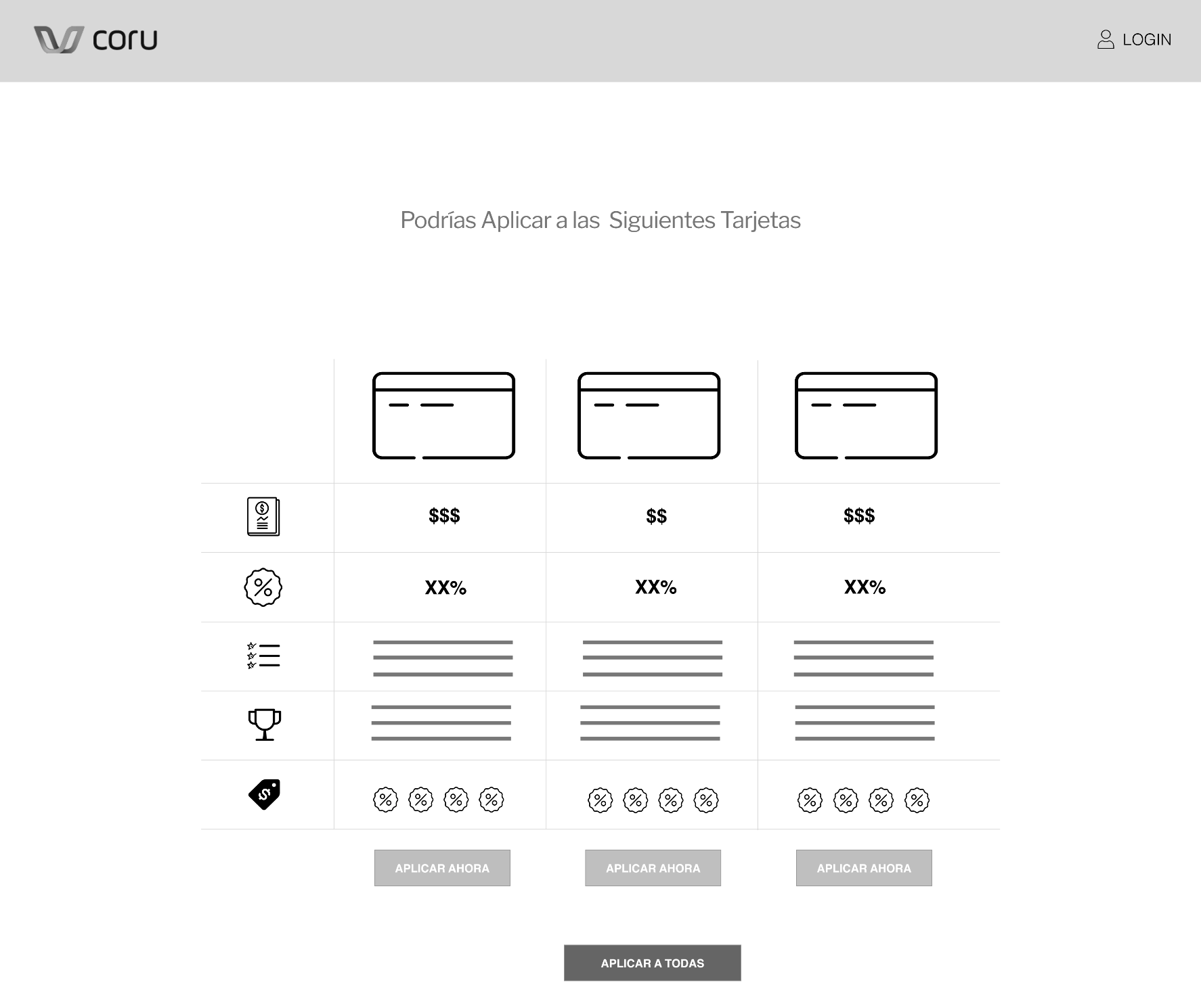
New Forms
Reduce the amount of information needed to give recommendations.
By mapping all of the information needed by each financial institution for considering a credit or insurance application we reduced the number of fields required to arrive at the recommendation page, delivering value to the visitors as fast as possible and allowing them to fill out the rest of the info after selecting a product to apply to.