Oriéntate is an online platform designed to give career orientation, helping high school students discover their strengths, opportunities and preferences; while involving teachers and parents in the process.
MY ROLE
UX Team of One
DURATION
2 Weeks
OBJECTIVE
Make career orientation questionnaires more appealing to students, make them feel more like a tool than a chore
Overview
The product uses a series of questionnaires to evaluate students and recommend possible career paths.
Without any revision since its launch on 2009 OrientaT faces a lot of challenges, from social media apps to the ever increasing library of media to be consumed on mobile devices, OrientaT must become more appealing as well as more accessible to its users.
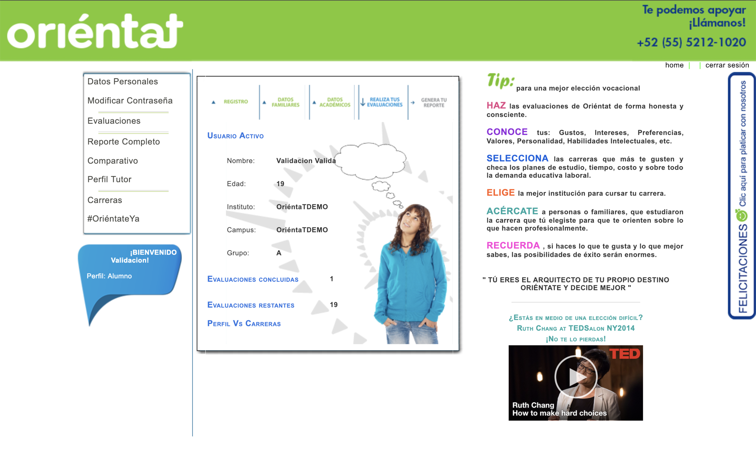
Main Dashboard before the project
Research
Evaluating the current platform
Orientat had already been operating for four years with a desktop-only version of their product. In that time they were able to gather data about how the product is used. Here are some of the findings from that data.
Low user interest in using the platform.
Being limited to desktop access, users commented they felt more like they were doing a chore rather than utilizing a tool for personal growth.
Students wait until the last minute before the assignment is due to answer the questionnaire.
Students try to trick the system, wanting to be done with the full assessment as fast as possible. Users lose interest and answer carelessly or resort to getting someone to finish the questionnaire for them.
From Users
I approached our target user, high school students between the ages of 15 and 19, for a better understanding of their relationship with technology and how they spend their free time.
Survey :100 👥
Interviews : 10 👥
50% spend more than 3 hours on their smartphone during a school day.
Users confess to spending more than half of their free time on social networks instead of studying or practicing a hobby.
Their favorite social network is Instagram because of how easy it is to go from one post to the next on the platform.
Usability Testing
In order to gather a better understanding of these behaviors, I conducted a usability test using the shadowing method. Six testers in the same group as the target users used the product and received career orientation.
From this test, I defined the following project goals:
Meet the users where they are
Make the instructions easier to understand
Help users answer as quickly as possible
Hypothesis
If users can answer the questionnaires from their smartphones, the product will have a better chance at competing for the students’ attention during their free time. Additionally, if it is easier to understand how to answer the questionnaires, the answers can be inputted faster and students will be more likely to complete the evaluation.
Meet the users where they are
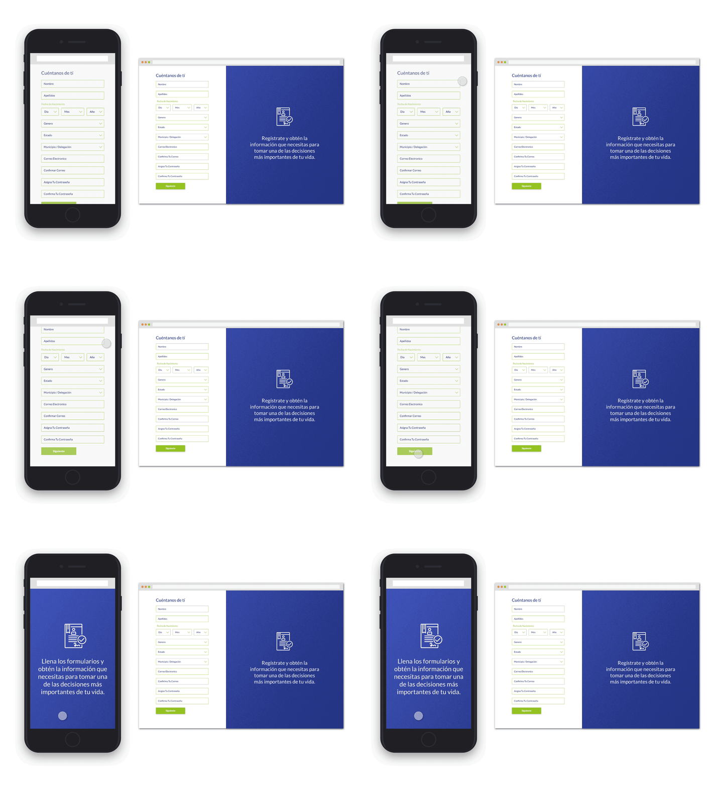
As students spend more and more of their free time on mobile devices, OrientaT should offer a mobile version so users can answer the test whenever they choose to. By reducing friction having multiple channels the task will be perceived less ass a chore.
Before
Make the instructions easier to understand
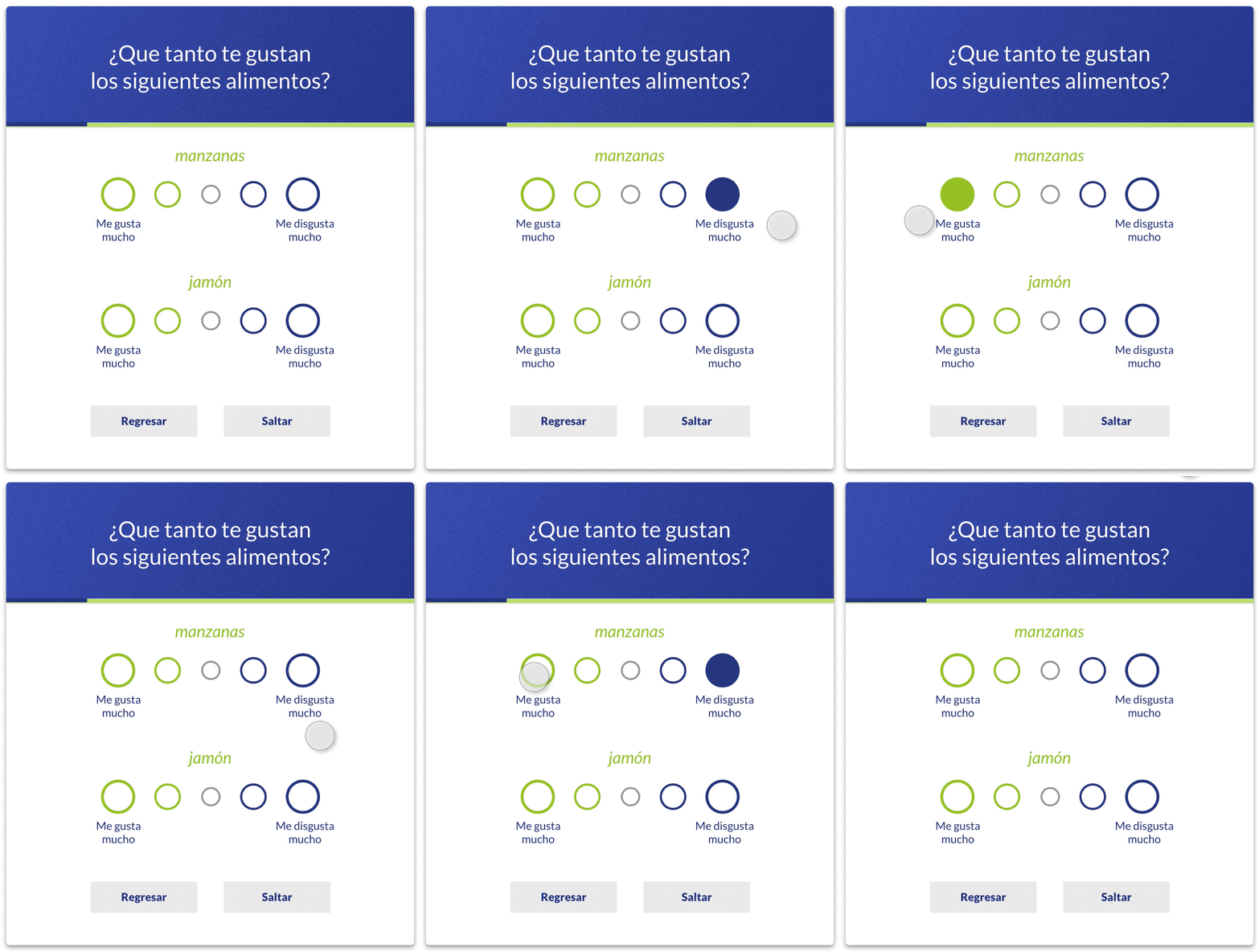
Improving form design with better input grammar, tasks are now easier to understand, and users spend less time reading instructions and are less prone to abandon the task.
After
Help users answer as quickly as possible
With better interaction design some tests can now be answered as fasts as scrolling though social media feeds. helping users move to the next question automatically while still giving them control to go back and change their answers


